Radio Group Field
Table of Contents
This is an advanced-use feature, and likely not something you'll need to configure. What you probably want is the content types reference!
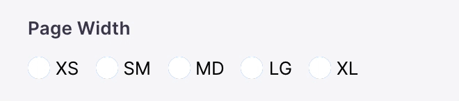
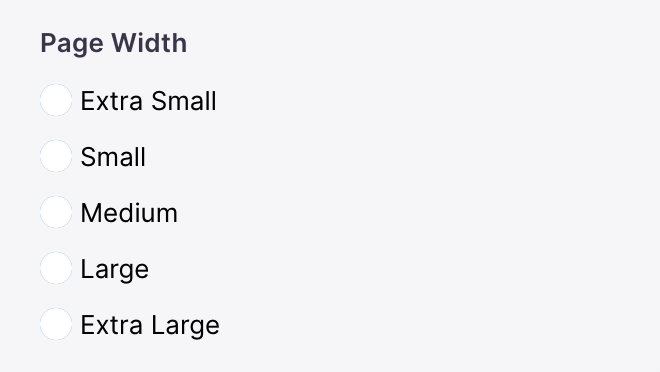
The radio-group field represents a group of radio inputs. It can rendered in a "horizontal" or "vertical" direction.
Options
| Option | Description |
component | The name of the plugin component. Always 'radio-group'. |
name | The path to some value in the data being edited. |
options | An array of strings or Options to select from. |
direction | An optional string indicating whether to render the radios in a "horizontal" or "vertical" orientation. This will default to "horizontal" if no value is passed. (Optional) |
variant | An optional string indicating whether the "radio" or "button" variant should be used. This will default to "radio" if no value is passed. (Optional) |
label | A human readable label for the field. Defaults to the name. (Optional) |
description | Description that expands on the purpose of the field or prompts a specific action. (Optional) |
interface RadioGroupField {name: stringcomponent: stringlabel?: stringoptions: (Option | string)[]direction?: 'horizontal' | 'vertical'}type Option = {value: stringlabel: string}
These interfaces only show the keys unique to the radio group field. Visit the Field Config docs for a complete list of options.
Example: Select an Rating
Below is an example of how a radio group field could be used to choose a rating of a customer review.
const ReviewForm = {fields: [{type: 'string',name: 'rating',label: 'Rating',description: 'Choose a rating for this review',options: [{ label: '★', value: 'one_star' },{ label: '★★', value: 'two_star' },{ label: '★★★', value: 'three_star' },{ label: '★★★★', value: 'four_star' },{ label: '★★★★★', value: 'five_star' },],ui: {component: 'radio-group',direction: 'vertical',},},// ...],}
Product
Showcase
Tina Cloud
Introduction
How Tina Works
Roadmap
Resources
Blog
Examples
Support
Media
Whats New
TinaCMS
TinaCloud
Use Cases
Agencies
Documentation
Teams
Jamstack CMS
Benefits
MDX
Markdown
Git
Editorial Workflow
Customization
SEO
Comparisons
TinaCMS vs Storyblok
TinaCMS vs Sanity
TinaCMS vs DecapCMS
TinaCMS vs Contentful
TinaCMS vs Builder.io
TinaCMS vs Strapi
Integrations
Astro
Hugo
NextJS
Jekyll
© TinaCMS 2019–2024